

Figma to React: Design to Code Conversion
From Figma to React: Introduction
Recently, within our team, a discussion emerged about converting designs made in Figma into React code. This conversation was sparked due to the constant evolution of tools available for developers. While the possibility of converting design to code has existed for some time, its implementation has been, frankly speaking, suboptimal. Following this debate, I decided to explore the current state of design-to-code conversion as of April 2024. The topic itself seems incredibly interesting and holds the potential to significantly speed up the work of front-end developers. But what is the reality of this practice?
Past practices of design-to-code conversion
Historically, tools such as Figma and Adobe XD have been widely used for designing and implementing websites. These tools offer a plethora of features that ease the process of creating web layouts for designers. Of course, it’s possible to achieve similar outcomes using Photoshop, Indesign, or even Paint. However, in the third decade of the 21st century, software has advanced to a point where dedicated tools not only expedite work in specific fields but also facilitate collaboration between different departments within a company.
The available tools typically allow designers to create a page that closely mirrors how it needs to be coded. For example, designed elements possess attributes like margins, colors, and shadows similar to those used in frontend programming. Tools like Figma and Adobe XD offer several options for copying element styles directly as CSS styles, whether from components within the program or through various modes or sharing options. Utilizing these tools to view and copy styles has become common practice, slightly accelerating the work of frontend developers and potentially eliminating some errors in the attempt to replicate a design.
AI Era in Frontend Development
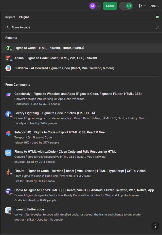
Lately, tools based on artificial intelligence have gained popularity, capable of performing a wide range of tasks to assist in various fields. Here, for instance, I’ve described how AI tools can aid programmers in coding and outlined their pros and cons (check an e-book about building app contept with AI). Similar tools have emerged for platforms like Figma and Adobe XD. Most often, they operate as plugins, and currently, many companies offer AI assistance in transforming Figma designs into code (not limited to React), e.g., Figma to React by Quest, Anima, Builder.io, Figma to Code, etc. Interestingly, these plugins offer different options in terms of output. In some, it’s possible to select the framework which code is generated for, or even the style processor such as SCSS, styled-components, or Tailwind.
AI plug-ins to transform Figma Designs to Code
Utilizing these plugins can typically be done in two ways, taking Figma as an example. Using it outside of developer mode often redirects us to the service provider’s page, while using the developer version allows us to preview the generated code in Figma.
To use the developer mode, you must have a subscription for the project in Figma. Additionally, nearly all the plugins I tested had their subscription model, with some free version capabilities.
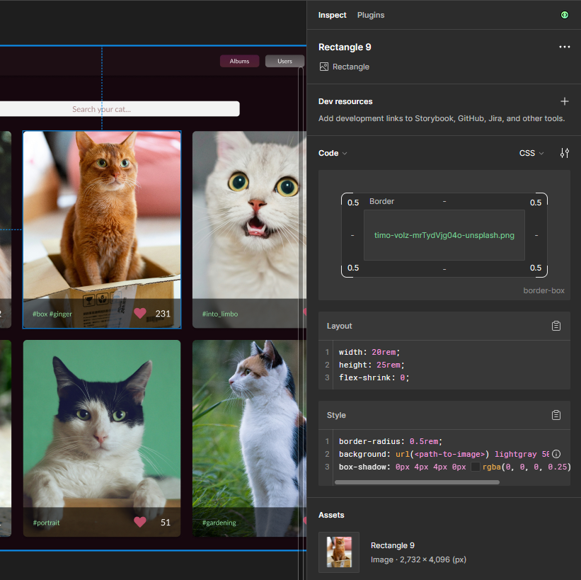
Simple Design: Basic structure of React’s JSX with nested DIVs and Tailwind styles
Using a very simple design that doesn’t contain nested components as an example, the result at first glance appears quite interesting… something is happening! We receive the basic structure of React’s JSX with nested DIVs and Tailwind styles.
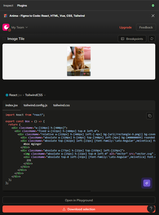
Anima plugin inside Figma dev mode.
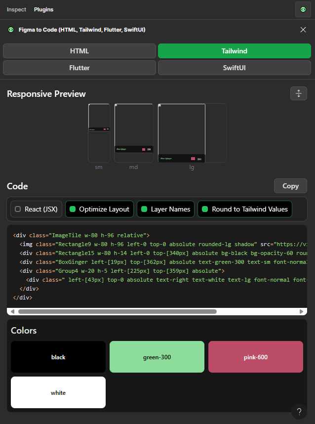
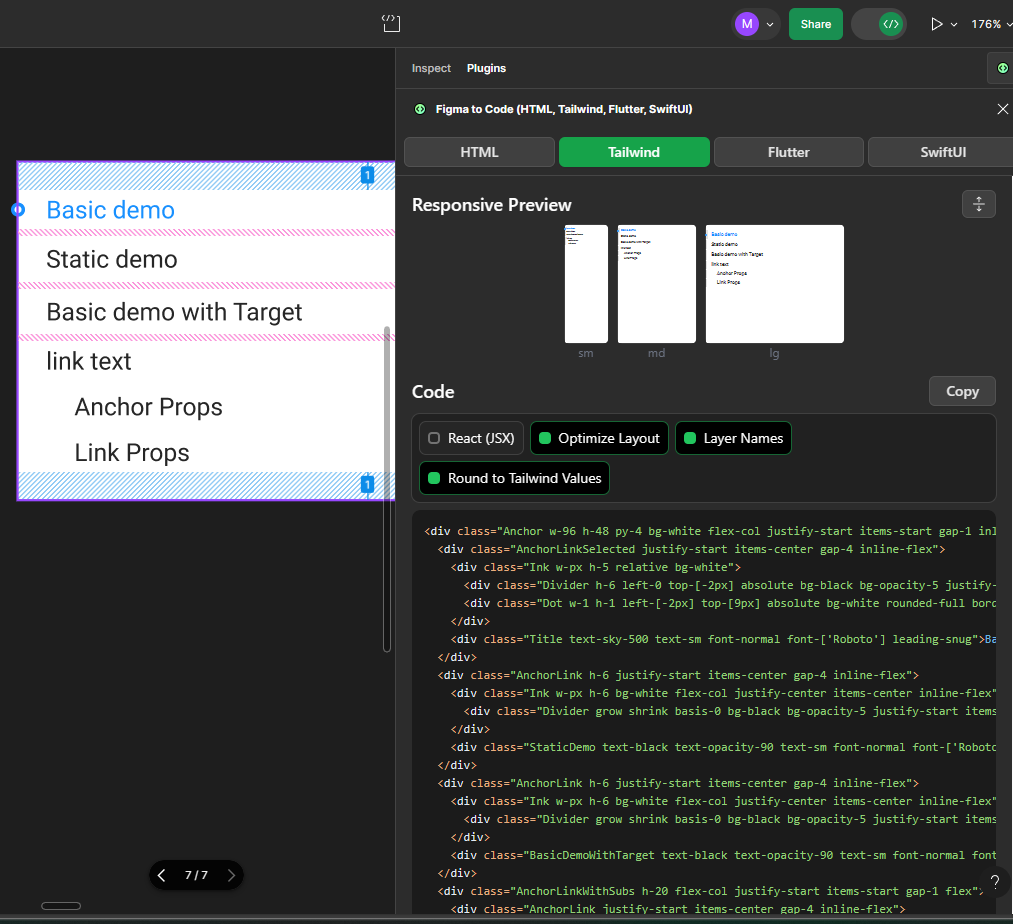
Figma to Code inside Figma dev mode
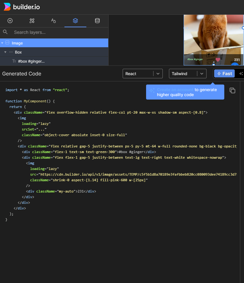
Builder.io code generated on Builder.io website.
The tools have minor differences among themselves. At first glance, everything looks quite good, and as a developer, you might start considering using the tool in your project… But wait a moment!
More Complex Projects: example on Figma’s Antd and Tailwind templates
For more complex projects, the generated code outcome looks different. I’ll use components from Figma’s Antd and Tailwind templates as examples because they already have a better-prepared element structure in Figma and more complex nested components. For more complex projects, results from different plugins vary more significantly.
Div structure from Figma to Code
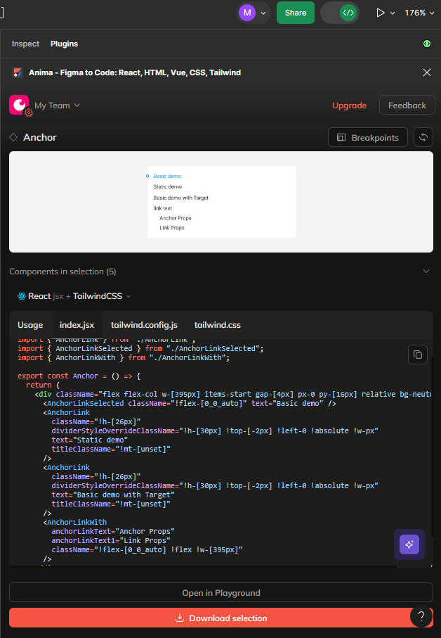
Literal components from Anima.
Some libraries, despite nested components, generate a flat structure of DIVs, but almost all struggle to generate something that matches the API of the used libraries. In the case of Antd, nested components literally correspond to what has been prepared in the component structure.
However, this structure does not match the library’s API… and it doesn’t match significantly. Even if the components we create ourselves have the structure we desire, we cannot count on a correct generation of components from Figma templates for specific libraries. When it comes to Tailwind components and other designs, AI tools stubbornly bypass many different styles, such as colors or shadows.
Here is an example of JSX code generated by Anima from the pink shades Tailwind’s template:
```
import PropTypes from "prop-types";
import React from "react";
import { DocumentationColor } from "./DocumentationColor";

export const DocumentationColorWrapper = ({
  text = "Gray (Cool Gray)",
  documentationColorSwatchClassName,
  documentationColorSwatchClassNameOverride,
  documentationColorDivClassName,
  documentationColorDivClassNameOverride,
  documentationColorSwatchClassName1,
  documentationColorSwatchClassName2,
  documentationColorSwatchClassName3,
  documentationColorSwatchClassName4,
  documentationColorSwatchClassName5,
  documentationColorSwatchClassName6,
}) => {
  return (
    <div className="inline-flex flex-col items-center gap-[24px] relative">
      <div className="relative w-fit mt-[-1.00px] font-text-xl-leading-7-font-normal font-[number:var(--text-xl-leading-7-font-normal-font-weight)] text-defaultgray-900 text-[length:var(--text-xl-leading-7-font-normal-font-size)] text-center tracking-[var(--text-xl-leading-7-font-normal-letter-spacing)] leading-[var(--text-xl-leading-7-font-normal-line-height)] whitespace-nowrap [font-style:var(--text-xl-leading-7-font-normal-font-style)]">
        {text}
      </div>
      <div className="inline-flex flex-col items-start relative flex-[0_0_auto]">
        <DocumentationColor position="top" swatchClassName={documentationColorSwatchClassName} />
        <DocumentationColor position="middle" swatchClassName={documentationColorSwatchClassNameOverride} />
        <DocumentationColor position="middle" swatchClassName={documentationColorDivClassName} />
        <DocumentationColor position="middle" swatchClassName={documentationColorDivClassNameOverride} />
        <DocumentationColor position="middle" swatchClassName={documentationColorSwatchClassName1} />
        <DocumentationColor position="middle" swatchClassName={documentationColorSwatchClassName2} />
        <DocumentationColor position="middle" swatchClassName={documentationColorSwatchClassName3} />
        <DocumentationColor position="middle" swatchClassName={documentationColorSwatchClassName4} />
        <DocumentationColor position="middle" swatchClassName={documentationColorSwatchClassName5} />
        <DocumentationColor position="bottom" swatchClassName={documentationColorSwatchClassName6} />
      </div>
    </div>
  );
};

DocumentationColorWrapper.propTypes = {
  text: PropTypes.string,
};
```
The code looks bizarre… but interestingly it’s also able to produce tailwind files:
```
/** @type {import('tailwindcss').Config} */
module.exports = {
  content: ["./src/**/*.{html,js,ts,jsx,tsx}"],
  theme: {
    extend: {
      colors: {
        "defaultgray-100": "var(--defaultgray-100)",
        "defaultgray-200": "var(--defaultgray-200)",
        "defaultgray-300": "var(--defaultgray-300)",
        "defaultgray-400": "var(--defaultgray-400)",
        "defaultgray-50": "var(--defaultgray-50)",
        "defaultgray-500": "var(--defaultgray-500)",
        "defaultgray-600": "var(--defaultgray-600)",
        "defaultgray-700": "var(--defaultgray-700)",
        "defaultgray-800": "var(--defaultgray-800)",
        "defaultgray-900": "var(--defaultgray-900)",
        "defaultpink-100": "var(--defaultpink-100)",
        "defaultpink-200": "var(--defaultpink-200)",
        "defaultpink-300": "var(--defaultpink-300)",
        "defaultpink-400": "var(--defaultpink-400)",
        "defaultpink-50": "var(--defaultpink-50)",
        "defaultpink-500": "var(--defaultpink-500)",
        "defaultpink-600": "var(--defaultpink-600)",
        "defaultpink-700": "var(--defaultpink-700)",
        "defaultpink-800": "var(--defaultpink-800)",
        "defaultpink-900": "var(--defaultpink-900)",
        "variable-collection-some": "var(--variable-collection-some)",
      },
      fontFamily: {
        "text-xl-leading-7-font-normal": "var(--text-xl-leading-7-font-normal-font-family)",
      },
    },
  },
  plugins: [],
};
```
And here is code generated by Builder.io:
```
import * as React from "react";

function MyComponent() {
  return (
    <div className="flex flex-col text-xl leading-7 text-center text-gray-900 whitespace-nowrap max-w-[160px]">
      <div className="self-center">Pink</div>
      <div className="mt-6 w-full bg-pink-900 rounded-none min-h-[80px]" />
      <div className="w-full bg-pink-800 min-h-[80px]" />
      <div className="w-full bg-pink-700 min-h-[80px]" />
      <div className="w-full bg-pink-600 min-h-[80px]" />
      <div className="w-full bg-pink-500 min-h-[80px]" />
      <div className="w-full bg-pink-400 min-h-[80px]" />
      <div className="w-full bg-pink-300 min-h-[80px]" />
      <div className="w-full bg-pink-200 min-h-[80px]" />
      <div className="w-full bg-pink-100 min-h-[80px]" />
      <div className="w-full bg-pink-50 rounded-3xl min-h-[80px]" />
    </div>
  );
}

```
This time it looks quite good without a bunch of weird looking additions.
Extending AI “prompt”
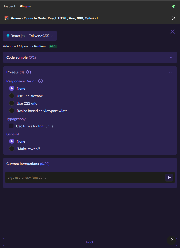
Some tools already mentioned contain an option to add an extra prompt to code generation.
For example Anima:
I think it’s an interesting option. As with other AI-based tools, they quite often get better while we interact with them. While just pushing designs to AI tools may always result in frustrating results, adding extra prompts may lead to gradually better code. But there is a catch. If you have ever tried to generate designs from AI tools like Midjourney of DALL E, you are probably aware of how many attempts it may take to lead to producing something valuable. Phrasing prompts correctly in order to achieve something close to our intentions requires some knowledge, time, and tricks.
Is it worth the effort for code generation?
Figma to React: with AI – is it worth it?
The examples provided here clearly show that with more complex projects, the choice of an AI plugin can make a significant difference. However, regardless of the choice, each time the generated code differed from what we wanted to achieve. When manually programming without AI tools, the Language Support Protocol (LSP) used by frontend programmers suggests quicker and more accurate components to use. Correcting bad code takes much more time than writing new code ‘by hand’.
Reviewing code generated by AI requires a lot of effort to confirm whether the code is correct. Because the code often appears as though it could function properly, it can easily mislead, which later can become very difficult to find and resolve in the code. Unfortunately, generating code that is not always compatible with the APIs of the libraries we intend to use is currently a significant issue with AI tools and it can often lead to asking ourselves a simple question: is this particular tool really necessary for us, or is it just a marketing hoax?
Playing with AI tools is quite fun so I recommend you test the capabilities of design-to-code tools for yourself (if you already have a subscription to use paid modes such as dev mode in Figma). As for incorporating in production projects, I would advise you to be very cautious.
And if you want to know more about building apps with React, check Frontend App Dilema, and backend for React.js articles.
Author: Michał Szulczewski
